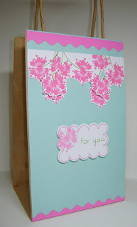
 i wanted to go away from the obvious banner look. i love these colors together. (PTI aqua mist & SU pixie pink(i think). the ink is Memento Rosebud & Bamboo leaves.
 i stamped the A Muse Bursting Blooms stamp off once before adding it to the tag, so the frame stamp would be brighter.
does anyone have any suggestions on what i could have done to make this acceptable for the mag? i was thinking maybe i shouldn't have let the flower stems overlap some of the flowers??


That's pretty - I like that you took the sketch in another direction - I did that too and got rejected also - remember they have over 700 submissions for only about 100 places to be in the magazine so there are bound to be rejections - it's all subjective!! I submitted 5 cards and got 5 rejections - there were two I was just convinced would make it in too!!
ReplyDeleteI love the color scheme! Very bright and pretty! Just be true to your beautiful style and keep on trying!
ReplyDelete